Each year, paint and interior brands reveal their colour forecasts for that year. These colours often mirror the social and cultural trends of our times.
In 2023, interior trends were about self-expression and being braver with vibrant, bolder colours. Earthy natural palettes offering cosiness and comfort remained popular but with pops of colour to emanate a feeling of playfulness and optimism.
In 2024, in a time of turmoil, brands are looking for colours that embrace a feeling of belonging and the need for nurturing.
Here, we look at some of the Colours of the Year for 2024 and other interior trends.
Pantone – Peach Fuzz
Pantone Colour Institute is recognised globally as a leading source of colour expertise, and this year marks the 25th anniversary of the Pantone Colour of the Year program.
In 2023, Pantone opted for a vibrant pinky-red called Viva Magenta, whereas this year, their COTY 2024 ‘Peach Fuzz’ is a gentle blend of pink and orange tones.
In their press release, Pantone called the colour “velvety gentle peach tone whose all-embracing spirit embraces the mind, body, and soul.”
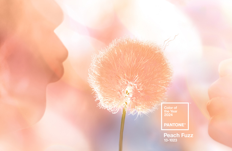
The colour emanates warmth and cosiness and works particularly well with soft pastel colours such as light blue, mint green and lavender and neutral colours such as tan and cream.
There are multiple ways this colour can be added into your home; you can paint a room or wall, or Peach Fuzz can be incorporated into the room with pictures or furnishings.
Dulux – Sweet Embrace
In 2023, Dulux’s Colour of the Year was ‘Wild Wonder’ – a positive, glowing tone inspired by the natural world and bringing nature indoors.
This year, like Pantone, Dulux stated in their press release that ‘people are craving simplicity, meaning, and a sense of belonging’, so they wanted their Colour of the Year to be a colour that will bring warmth to a space and make people feel at ease.
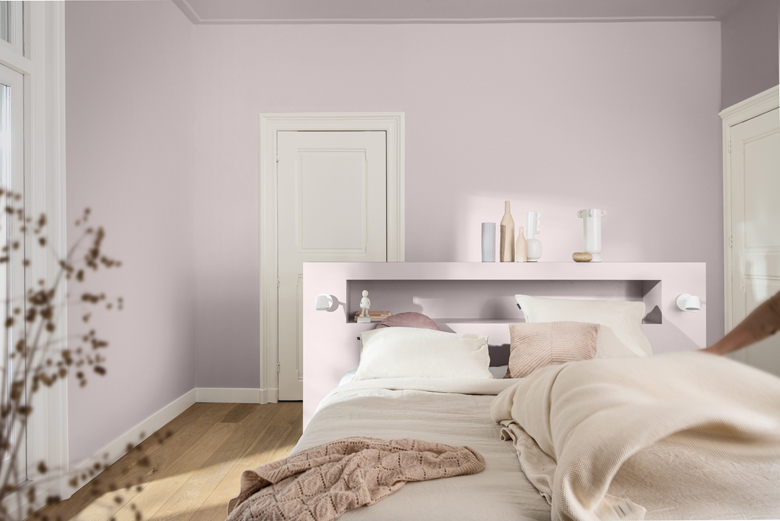
‘Sweet Embrace’, described as a gentle, blossom pink, can be used alone or in combination with other colours. As you can see, pairing it with white or cream in the bedroom creates a calm and harmonious space.
However, to help us, Dulux creates new colour palettes each year to complement its Colour of the Year, so we can be creative and confident that those combinations will work.
We particularly like the colours they have created on the warm colour palette, such as Winter Pumpkin and Fireside Embers. These earthy tones work so well with the soft pink, especially in north-facing rooms, as they bring warmth and comfort.